
The first step in a good presentation is not decoration; it’s a message. A slide should include one core idea, lead the viewer through a clear, logical sequence, and provide sufficient space for the speaker to articulate the idea without having to read through so much text it overloads the audience.
Teams that manage decks with review cycles, speaker notes, client comments, and version history benefit from document workflow automation when presentation files move through approvals before a meeting, sales call, training session, or webinar. With a clean workflow, there’s less of a chance for outdated slides, conflicting edits, and formatting errors at the last minute.
Foundations of Clear Slides
Slide hierarchy communicates to the audience what should be observed first, second, and third. A title should state the point, the main visual should substantiate or clarify the point, and the supporting text should be short enough to read from the back of the room in a couple seconds.
Another advantage of good presentation design is attention span. If your audience has to read a paragraph, interpret a chart, follow a speaker, and compare numbers at the same time, understanding will be reduced due to the multiplicity of tasks.
Design Details That Change Readability
Beginners make rapid progress by concentrating on text size, contrast, alignment, the purpose of the image, the simplicity of the chart, and discipline in reviewing. These details matter when it comes to showing a slide in a conference room, on a laptop screen, via a projector, or in a video call that is shared.
Visual Hierarchy
Visual hierarchy creates order. Larger type, stronger contrast, and placement near the top or center tell viewers what matters most, while small captions and secondary labels carry lower priority.
A practical hierarchy uses consistent roles across the deck:
- One message title per slide
- One primary visual or data point
- Short supporting text under the main idea.
Consistency matters because the audience learns the system. If every slide uses a new title position, color rule, or chart style, viewers spend extra effort decoding layout instead of listening to the presenter.
Text and Contrast
In general, slide guides suggest 18 points or greater for body text and sans serif fonts. Larger body text is better for live presentations since they will be less legible due to distance, room lighting, and projectors.
WCAG contrast guidance gives useful numeric targets: normal text should meet at least a 4.5:1 contrast ratio, while large text needs at least 3:1. These ratios come from web accessibility standards, but they also help with slide readability, especially for people viewing from the back row or on dim screens.
The design choices below compare common beginner mistakes with stronger alternatives:
| Design Element | Weak Choice | Stronger Choice |
| Font size | 12 pt body text | 18 pt or larger body text |
| Contrast | Pale gray on white | Dark text on light background |
| Chart labels | Tiny axis labels | Direct labels near data |
| Image placement | Decorative full-slide photo | Cropped image tied to the message |
A slide needs enough contrast, predictable spacing, and a clear difference between the headline, key visual, and supporting details.
Images and White Space

Images should explain the point rather than fill empty space. A product photo, workflow screenshot, location image, or speaker portrait belongs on the slide when it adds context that text alone would not deliver.
White space is part of the message because it separates ideas. Margins around text, breathing room near charts, and open space around images make the important content feel easier to process.
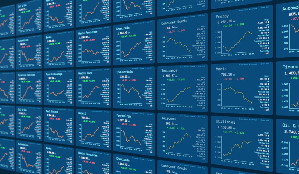
Charts and Data
A chart should answer one question. If the point is revenue growth, the chart should emphasize the trend, label the key year, and avoid extra gridlines, legends, colors, or data series that do not support that point.
Chart readability depends on visible labels and simple comparisons. A bar chart works well for category comparison, a line chart works well for change over time, and a pie chart becomes hard to read when it has many small segments.
A Better Deck Before Delivery
A good final presentation is designed, reviewed, and tested. The review process should include content accuracy, reading order, accessibility, visual consistency, speaker notes, file naming, and whether each slide still supports the main objective.
File review should happen before the final export. A team should check that charts use current data, links open correctly, images have permission or proper ownership, and hidden notes do not contain outdated comments.
The strongest beginner habit is reducing every slide to one decision: what should the audience remember after seeing it. When the answer is clear, design choices become easier, and the deck feels more professional without unnecessary decoration.