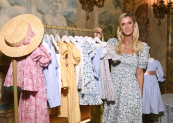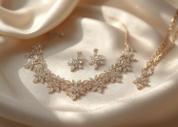
Looking stylish doesn’t always require designer labels or a high budget. One of the most powerful ways to elevate your appearance is through smart color choices. Certain color combinations naturally create a polished, refined, and high-end impression, regardless of the price tag. Understanding fashion color combinations that look expensive allows you to build outfits that feel intentional, elegant, and effortlessly chic.
This article explores classic and modern color pairings, explains why they work, and shows how to apply them to everyday outfits for a luxurious aesthetic.
Why Color Combinations Matter in Fashion
Color plays a major role in how an outfit is perceived. Expensive-looking outfits often share common traits:
-
Balanced contrast
-
Muted or harmonious tones
-
Clean color separation
-
Minimal visual noise
The most successful fashion color combinations that look expensive rely on simplicity and cohesion rather than loud or overly trendy shades.
Black and Ivory: The Ultimate Luxury Pair
Black and ivory is one of the most timeless color combinations in fashion. Unlike harsh black-and-white contrasts, ivory softens the look and creates a more refined finish.
Why it looks expensive:
-
High contrast without being stark
-
Frequently used in luxury fashion houses
-
Works well with tailored silhouettes
This pairing is perfect for formalwear, office outfits, and minimal everyday looks.
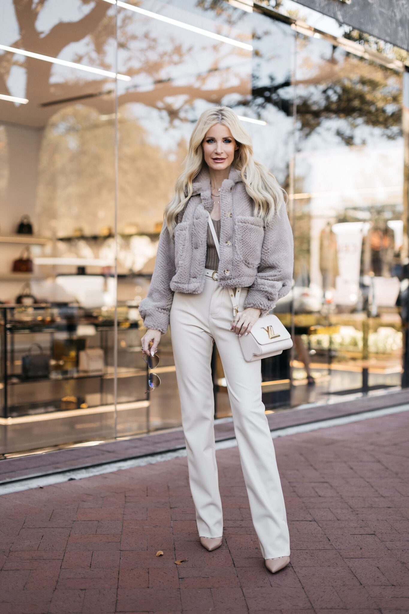
Beige and White: Effortless Elegance
Neutral tones are a cornerstone of elevated style. Beige and white together create a clean, fresh, and expensive aesthetic.
Best ways to wear it:
-
Beige trousers with a crisp white shirt
-
White dresses layered with beige coats
-
Neutral accessories in matching tones
This is one of the fashion color combinations that look expensive because it feels intentional and timeless.
Navy Blue and Camel: Quiet Luxury at Its Best
Navy and camel are understated yet powerful. This combination avoids loudness while still offering depth and contrast.
Why it works:
-
Navy replaces black for a softer look
-
Camel adds warmth and sophistication
-
Common in luxury outerwear and tailoring
Ideal for coats, blazers, and structured handbags.
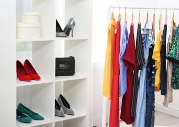
Monochrome Neutrals: One Color, Multiple Shades
Wearing different shades of the same color creates a layered, expensive effect. Monochrome outfits appear well thought out and visually elongated.
Popular monochrome palettes include:
-
All-grey
-
All-brown
-
All-cream
This styling trick is frequently used by stylists who dress clients in Best Fashion Brands for Petite Women to create height and cohesion.
Grey and Soft Pastels: Modern Sophistication
Pairing grey with muted pastels like blush, lavender, or sage results in a refined and contemporary look.
Why it looks luxe:
-
Grey grounds the softness of pastels
-
The combination feels calm and intentional
-
Avoids overly bright or juvenile tones
This is a great option for daytime outfits and smart casual settings.
Chocolate Brown and Gold Accents
Deep brown tones paired with gold details create warmth and richness. This combination feels luxurious without being flashy.
How to style it:
-
Brown outfits with gold jewelry
-
Chocolate coats with tan or metallic accessories
-
Brown leather bags with gold hardware
Earthy tones like brown are increasingly popular in fashion color combinations that look expensive.
White and Denim Blue: Clean and Classic
A crisp white paired with quality denim creates a timeless and expensive appearance when styled correctly.
Tips to elevate this combo:
-
Choose structured denim over distressed styles
-
Stick to classic blue or dark washes
-
Add neutral shoes or minimalist accessories
This combination proves that simplicity often looks the most refined.
Black and Taupe: Subtle and Polished
Taupe is a soft neutral that pairs beautifully with black. This pairing offers contrast without harshness.
Why it feels premium:
-
Taupe softens black
-
Creates depth without overwhelming
-
Common in tailored fashion
This is ideal for winter wardrobes and office-ready outfits.
Olive Green and Cream: Understated Luxury
Olive green brings an earthy sophistication when paired with cream. This color duo feels grounded and elegant.
Best uses:
-
Knitwear and trousers
-
Outerwear combinations
-
Casual luxury outfits
It’s a favorite among stylists who prefer subtle, rich tones.
Burgundy and Grey: Rich but Balanced
Burgundy adds depth and richness, while grey keeps the outfit balanced and refined.
Why it works:
-
Burgundy feels luxurious without being loud
-
Grey tones down intensity
-
Perfect for fall and winter looks
This pairing is excellent for evening wear or smart casual outfits.
Styling Tips to Make Any Color Combination Look Expensive
Even the best colors need proper styling. Keep these principles in mind:
-
Prioritize clean tailoring and proper fit
-
Avoid too many colors in one outfit
-
Stick to muted or neutral accessories
-
Choose fabrics with texture and structure
-
Maintain consistency in undertones
These techniques enhance all fashion color combinations that look expensive.
Common Color Mistakes That Cheapen an Outfit
Avoid these errors if you want a polished look:
-
Mixing too many bright colors
-
Pairing clashing undertones
-
Overusing bold prints with strong colors
-
Ignoring fabric quality
Sometimes removing one color is enough to elevate an entire outfit.
Final Thoughts
Mastering fashion color combinations that look expensive is one of the simplest ways to elevate your style without increasing your budget. Neutral palettes, classic contrasts, and thoughtful pairings create outfits that feel intentional and refined.