
Your website gets traffic. Your analytics show plenty of visitors. But the phone stays quiet, and the contact form gathers dust. This frustration plagues many law firms. The problem isn’t your expertise or your reputation. It’s your website.
People judge your firm in seconds. They form opinions before reading a single word. A cluttered homepage or confusing menu tells them you’re disorganized. Slow load times suggest you don’t respect their time. Poor mobile accessibility means you’re stuck in the past. These silent messages destroy trust before you have a chance to earn it.
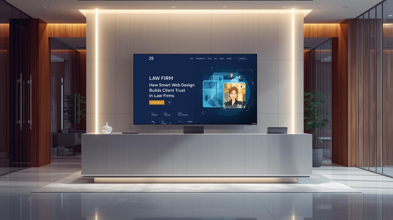
Structure Tells Your Story
Good law firm web design starts with clear structure. Visitors should understand what you do within three seconds. Your homepage needs a simple headline that names your practice area and location. Navigation menus should use plain terms like “Practice Areas” and “Contact Us” instead of creative labels that confuse people.
Every page needs one clear purpose. Your about page introduces your team. Service pages explain how you help. Case results show your track record. When each page has a job, visitors find answers fast. This clarity builds confidence that you’ll handle their case with the same care.
Attorney credibility grows when your website looks current. Outdated designs with stock photos from 2010 make people wonder if you keep up with the law. Clean layouts with real photos of your team show you’re active and engaged. Professional headshots matter more than fancy graphics.
Tone Shapes First Impressions
Legal language intimidates people who need help. Your website copy should speak like a trusted advisor, not a textbook. Short paragraphs work better than dense blocks of text. Simple explanations of complex topics prove you can make the law understandable.
Website usability improves when you write for real humans facing real problems. A personal injury visitor wants to know if you’ve handled cases like theirs. A business owner needs to understand how you protect companies. Speaking directly to their concerns creates connection.
Your UX layout should guide visitors through a natural flow. Someone lands on your homepage. They click to learn about your services. They read attorney bios. Then they see a clear path to schedule a consultation. Each step should feel obvious and easy. When people have to hunt for information, they leave.
Navigation Makes or Breaks Trust
Think about the last time you struggled with a confusing website. You probably gave up and found a competitor. Your potential clients do the same thing. Simple menus with five to seven main options work best. Dropdown menus can organize subcategories without cluttering the main navigation.
Search functions help visitors who know what they want. Contact information should appear on every page, not just the contact page. Phone numbers in the header let mobile users tap to call. These small details show you make things easy for clients.
Mobile accessibility isn’t optional anymore. More than half of web traffic comes from phones. If your site doesn’t work smoothly on small screens, you lose those visitors. Buttons need to be large enough to tap. Text should be readable without zooming. Forms should be simple to complete on a phone.
Firms that invest in professional web designs for law firms see better results because they understand these principles. They know that design isn’t about looking pretty. It’s about removing barriers between you and potential clients. When your site works well, people trust that you’ll work well for them.
Speed and Function Signal Competence
A slow website suggests incompetence. Pages should load in under three seconds. Large images and complex scripts bog down performance. Optimizing your site shows attention to detail. Fast load times keep visitors engaged and improve lead conversion rates.
Broken links and error pages damage credibility fast. If you can’t maintain your website, why would someone trust you with their legal matter? Regular testing catches these issues before clients see them. Working forms that actually deliver messages prevent lost opportunities.
Your contact forms should ask only for essential information. Name, email, phone number, and a brief message box. Long forms with required fields for information you don’t need create friction. Every extra field reduces the chance someone will complete it.
Take Action Today
Visit your website on your phone right now. Try to find your phone number. Navigate to your practice areas. Fill out your contact form. How did it feel? If you found frustrations, your clients feel them too.
Law firm web design shapes trust before you shake a single hand. Your website either opens doors or closes them. Audit your site for clarity. Check that your message comes through in seconds. Make sure navigation feels natural. Verify that mobile users can reach you easily.
Your expertise deserves a website that reflects it. When design and function work together, your site becomes your best tool for building client relationships.